Finishing Touches
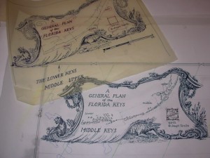
 Once things are drawn and painted, what remains to finish up the maps is the words and symbols that complete peoples’ expectations. The labels, graphics and type fonts that help viewers orient themselves and understand the areas depicted are critical to engaging them. The names of familiar towns, notable landmarks or bodies of water, etc. all serve to connect with and draw someone in. How elaborate or decorative they should be depends partly on the style of the overall images but also on establishing a hierarchy of importance of the information. The biggest, fanciest letters usually represent the most important words. The main title (A GENERAL PLAN OF…), a big town (NEW YORK) or a large area of water (ATLANTIC OCEAN) deserve more emphasis than a small pond or a back road. Lesser elements are still important but the order of magnitude needs to be respected and fall with peoples’ expectations. Otherwise, the mapmaker can be suspected to be a poor judge of choices and all aspects of the map can be called into question. Does the North Arrow really point north? Is the Scale truly reliable? Can that distance shown really be a mile? This is literally “territory” that no mapmaker wants to find themselves in. How to convey this most basic of informational pieces completes and validates the finished product.

